A Marketing Strategy Isn’t Just About Content
Presentation is just as important as the substance of your message.
To break it down even further, colour is the aspect you should focus on most when it comes to the general appearance of your content. It affects readability, makes your audience see what you want them to see, but above all else it acts as an emotional cue.
As a result, it will come as no surprise when we say that poor use of colour may negatively impact your content’s effectiveness. This could mean something as simple as it just isn’t eye-catching enough, but could be as serious as stirring up the wrong emotions within your prospects. Either way, this is something you want to avoid.
But how?
The Basics of Colour Theory
Before we get into how exactly colours impact your marketing content, it’s worth brushing up on the basics.
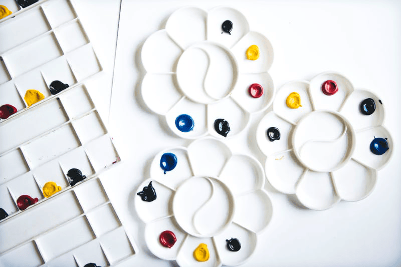
To start with, there are three tiers – primary, secondary and tertiary colours. Everything descends from the three primary colours red, yellow and blue. All of these colours, regardless of what tier they’re on, are otherwise known as pure colours.
From pure colours, you can also get tints, shades and tones. These are achieved by adding either white, black or grey into the mix.
For example:
Tint = pure colour + white
Shade = pure colour + black
Tone = pure colour + grey

Contrast
To put it simply, contrast is how one colour stands out against another.
High contrast means two colours are easy to tell apart, whereas low contrast means the opposite.

All of this might seem like information that would be of more use to a designer, but it is important for you, as a marketer, to know. When creating content, you need to think in terms of appearance as well as messaging. Having a basic understanding of the colours you use throughout your brand and how they interact with each other will bring these two elements together more effectively, meaning you get more of what you want from the content you publish.
The Psychology of Colours
Whilst colour theory in general is pretty straightforward and closed off to interpretation, colours themselves are not.
All colours convey different messages, and these messages can change depending on how much or how little a colour is used.
Let’s talk about the colour red for a second.
Red is a colour that is filled with emotion and promotes a physical response when you see it. How dominant red is in any given composition will significantly affect how you feel about seeing it.
When used in large quantities, red can trigger negative emotions. It can create a sense of danger and leave the viewer feeling attacked in some way. However, when used sparingly, it can spark excitement and passion. It draws the eye towards it instead of launching an assault on the senses.

What Does This Mean for Marketers?
As we said at the start of this article, using colours in the wrong way can negatively impact how content is viewed. They can invoke the wrong emotions, which will impact how your target audience engages with what you publish.
However, when used correctly, colours will enhance what it is you’re trying to get across. And the beauty of all this is it can be applied to virtually any medium. Images and video content can use a certain colour palette depending on what you want them to draw out of your audience, and when it comes to your website and copy, you can use colours in the overall design to give a certain vibe.
Even with just a little basic knowledge of colour theory and psychology, it is simple to add another dimension to your marketing strategy by altering the way it looks. The use of colour is a straightforward but effective way of manipulating your audience’s emotions so that they connect more with the message you’re trying to get across, and as we all know, that emotional connection is hugely important when it comes to successful marketing.